The redevelopment of our site
We've reflected on the development of our new site, discussing some of the trends of the last few years that have influenced the process.
If you're planning to read on from here, we'd wager that you're in the industry too, or at least thinking about the process of re-developing your website. It's tricky, isn't it?
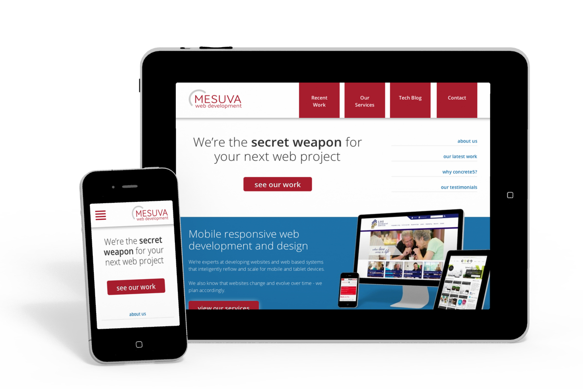
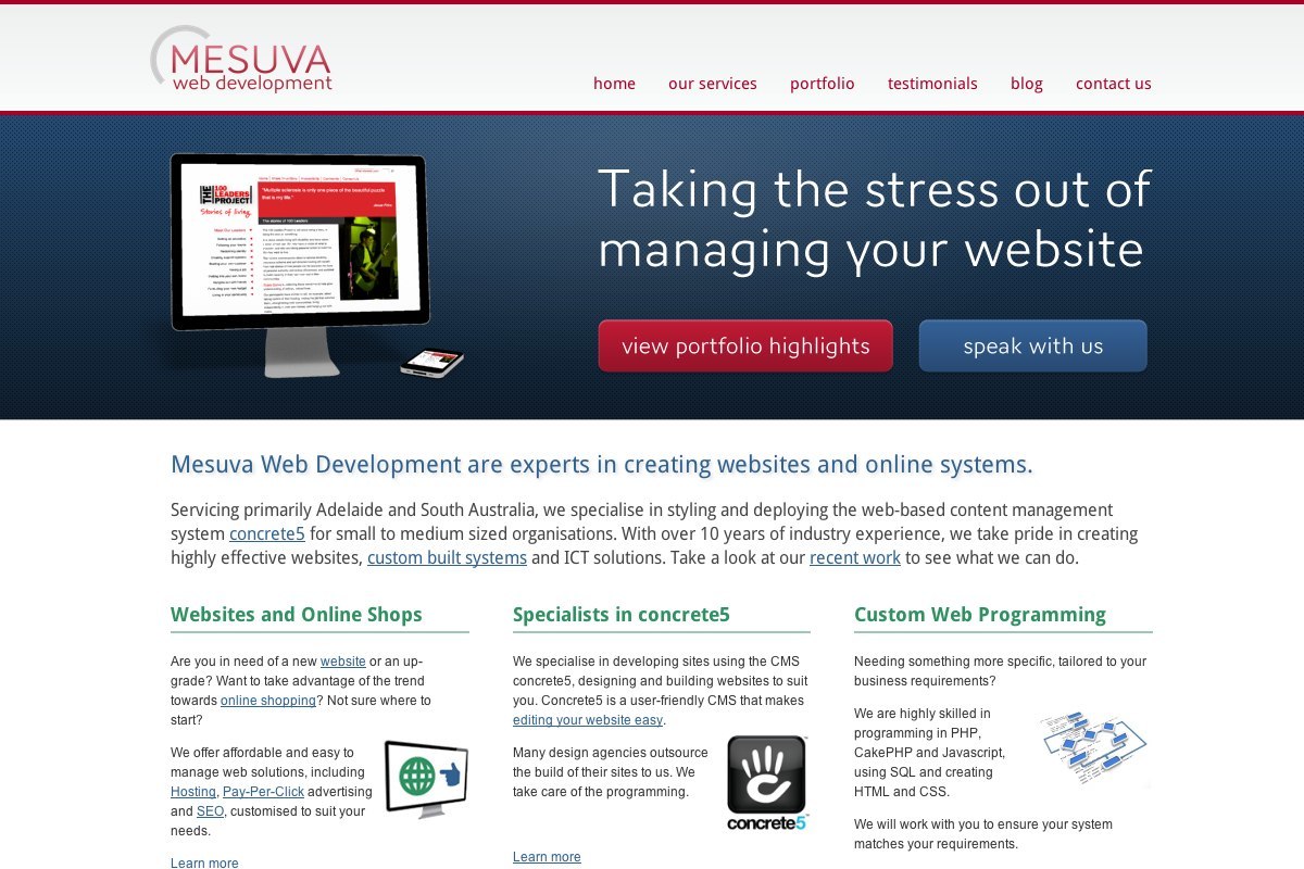
You're seeing our new website, one that replaces a site that was created around two years ago.
The new design isn't complex - it's intended to be a simplification and more neutral. Even in this simplicity, this new site has taken multiple revisions, lots of over-thinking, and plenty of interesting discussions with our friends in the industry. We've heavily re-thought the purpose of our site, reflected on our previous site and what we actually wanted to do with it in the future. We didn't want our site to be something that was built and forgotten about, we wanted it to be a platform we use to regularly blog and present what we do succinctly and accurately. We see our site also as an opportunity to try new technologies and approaches to web development, so not only is it exciting for us to launch a new site, but it's the culmination of a lot of experimentation.
Design trends
Website design has naturally shifted inline with the new and broader ways people are accessing information on the web. The use of effective or creative typography has increased dramatically, with things like vertical rhythm, optimum line lengths and font pairing being given as much consideration as colour palettes in a design. Gone are the days of designing a mock up in Photoshop to fit a 1024x768 screen, intended to be chopped up into a web design. Designers are now heavily encouraged to wire frame their designs, identifying usability issues and visual hierarchies before getting stuck into actual designs. Designers are going as far as creating style guides (or 'style tiles'), rather than fixed versions of how a site should look. I'd suggest the web has collectively swung back to placing content first again, rather much like the very early days of the web.
With our new site, we mocked up some design concepts in Illustrator, but we found that many of the styling decisions needed to be made as we were building the site. We knew the look and feel we were after, but we placed usability and readability as priorities, meaning that we needed to routinely review how layouts were working on our mobiles and tablets.
Ranges of screen sizes, touch screens and high pixel densities
No longer can web developers target common screen resolution sizes, or even target just for iPhones and iPads. As we simply don't know what devices are around the corner, we have to create designs and sites that work across a wide range of screen sizes.
On top of this, mobiles, tablets and now computer screens themselves are much higher in pixel density, i.e. 'retina' screens. We're finding that sites that are attractive on desktops can sometimes lose their 'crispness' on high density displays and really lose their impact. As time goes on, and screen technology continues to improve, considering 'retina readiness' is only going to become more critical.
As we wanted our new site to have longevity, we realised we needed to be aggressive in removing pixel-dependant resources. Nearly all of the site is CSS driven, and the logo is SVG - the site and logo look crisp regardless of device.
In the last year we have also made heavy use of icon fonts, as these scale beautifully and can be visually styled easily using CSS. Things like the social media icons and the search button are all icon font glyphs. Ignoring screenshot images and the IE8 fallback for the SVG logo, the theme for this new design has a grand total of two pngs, both decorative backgrounds used on the home page, intended to be swapped out over time.
Websites are not longer just 'clicked' on, they are tapped, swiped and pinched. Small links that are fine for the precision of a mouse become difficult for touch screen users. Specific mobile/touch friendly menus are now employed, in all sorts of variations.
For our new site we decided to create our own mobile menu system, based on a design pattern that we felt was effective and usable.
Less is more
We've realised that often the most effective sites are the ones that get straight to the point. Visitors generally don't want to read large amounts of text - they have a problem and want to quickly find a solution.
On our new site, we've made an effort to aggressively remove unnecessary text. If we want to write in depth, that's what our blog is for.
Blogging about what we do is more important than we realised
Reviewing the traffic we received from the previous site, we found that much of it was of visitors landing on a particular blog post, something that was highly relevant to them. Although it's important to have information pages about your business, we see that we need to create content of value, and not just promote ourselves.
Although our system to add blog posts to our old site was quite sophisticated and effective, it never quite felt like it invited us to post our findings and new projects. To fix this, we wanted our blog to feel more like a 'blank slate', giving as a more balanced and neutral layout to post images, code and videos.
We also realised that we should treat the postings of new sites we've developed as blog posts in themselves. Instead of just showing screenshots of a project we've developed, we're planning to share the process, the problems we encountered and how we resolved them.
Using Sass, Compass and Susy
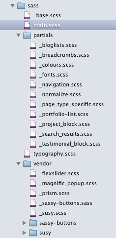
Over the last several months we've made a development shift from writing CSS manually, to making full use of Sass and Compass, plus Susy for responsive grids.
What we've found is not only do these technologies make us more efficient during website builds (and help us to maintain our sanities), they're fantastic if you want to make changes down the track. We're now massive fans of removing presentational classes from our mark-up (e.g. class="five columns"), meaning that if we do want to make more major styling changes down the track we're not stuck with a tangle of structure and CSS. We're also able to more effectively target specific breakpoints to solve styling issues.
We're now more focused on our strengths
When we first started our business we tried to appeal to as broad an audience as possible. Over time, we've recognised that our greatest strengths are in working with designers and agencies as technical specialists. On our former site, we appealed to these clients with only a short paragraph and didn't really 'talk' to who we actually now work with.
We feel our new site better reflects our clients - we still work directly with businesses and organisations to build great websites, but we're now proudly highlighting our technical skills and strengths, and the way we work with creatives.
Thanks
We're excited about the future of our business, how the technologies of the web are evolving and our refreshed site. Please feel free to leave feedback or questions.
Ryan and Lelita