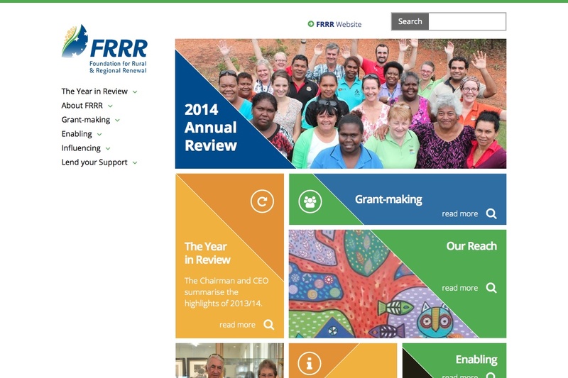
Frrr Annual Review for 2014
This is the third iteration of the Foundation for Regional Renewal Annual Review that Mesuva has been a part of producing. This year's project highlighted once again the power of multiple themes.
Working with Jaw Communications who direct the project and generate content and Scott Hutton from Twenty20 Graphics who developed the design and infographics, Mesuva developed this years website theme and technical elements.
Project Highlights
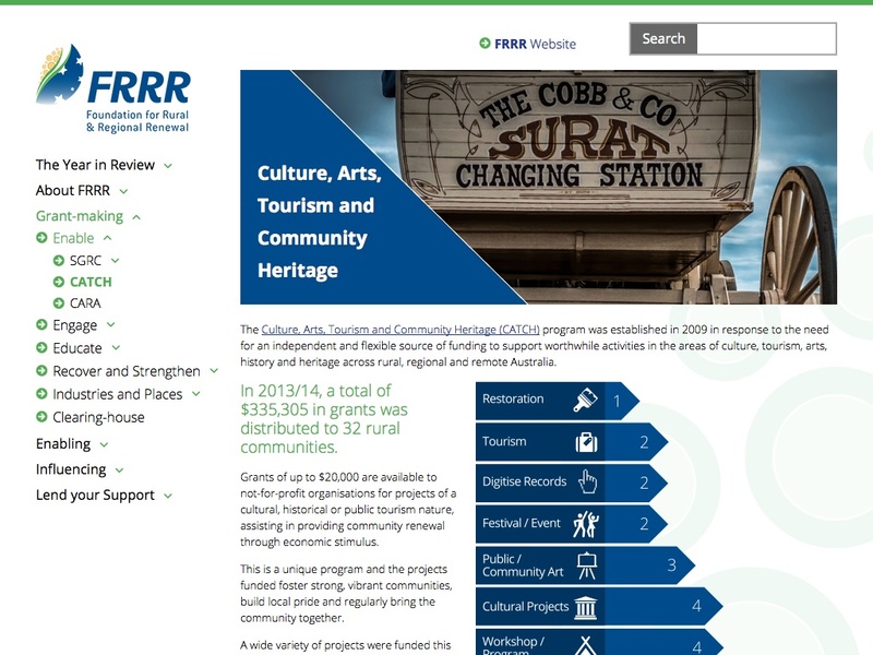
- Various interactive graphics to display fund distribution
- An interactive graphic of the FRRR staff for visitors to “meet the team’
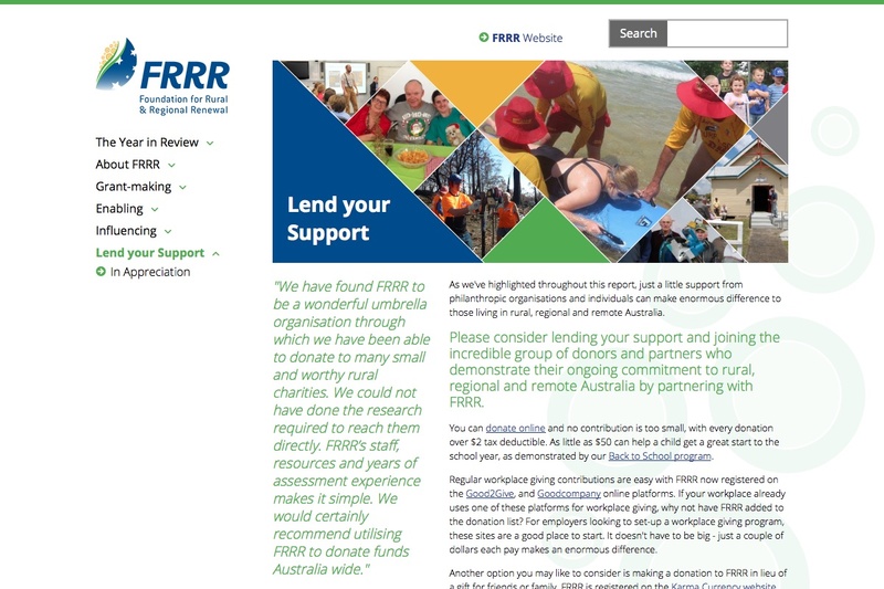
- Interactive page grids that allow users to click on photos for more information or to open an embedded youtube video.
- Expanding side menu for clear site navigation
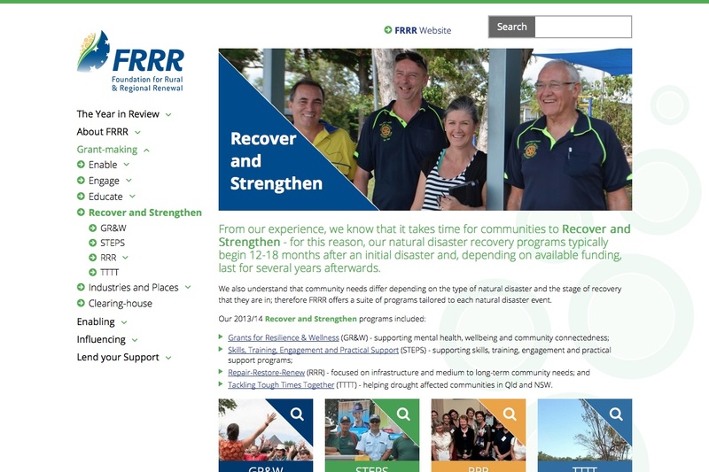
- Various page layouts to suit varied content
This year's interactive elements
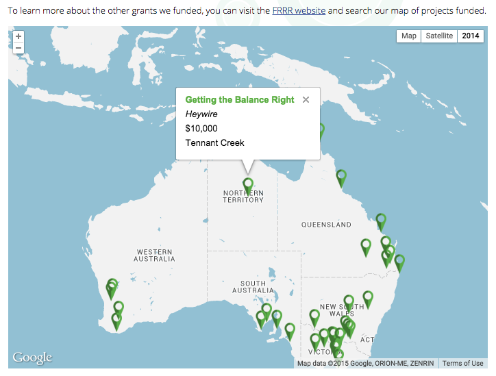
Embedded Google map with information display
An embedded Google map with clickable pins was created. This block allows specific locations to be added, with a summary of the program, displaying the breadth of FRRR’s influence. This pop up information also links through to the location page where the full detail can be read.
Creating interactive graphics
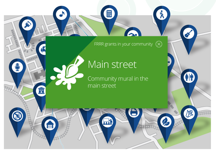
This year we used the program Hype2 to produce the interactive graphical elements. This program allows you to create ‘scenes’ to display the interactive elements. It is particularly powerful when it comes to making adjustments to text or images – allowing you to change individual moments, rather than having to re-create the entire graphic.
These graphics interact via hover and mouse click.
‘Isotope’ driven gallery with embedded youtube video
Like last year, we used an isotope driven gallery to display photos on a page that when clicked would move and enlarge to display more detail/ information. This year we created two different ‘styles’ for this interactivity to allow for varied content requirements. The addition of an embedded youtube video opening for display when a photo is clicked was also added.
SVG 'fall back' Block
Most of the static graphics on the site are svg files to ensure a crisp display. However, as not all browsers support svg format, we used our ‘fall back’ image block that allows us to place both the svg and the png file on the site with the browser displaying accordingly.
Multiple users
To make the editing process smoother this year, we created multiple user logins. This meant that different people could log in and make changes to the site, without interfering with each other. If a different user is editing a page a note tells you, so you know to wait until they are finished, preventing us from overriding each other.
